
The operator can get a graphical representation of the transport recorded in RITA grouped by location (origin and destination location, region and sub-region), product category, service user, and its type, filtered by weight and date range.
Different criteria for filtering the data are listed below:
Show Metric: Show metric dropdown allows RITA operator to switch between displaying weight, volume, value, number of consignments, consignment line and dangerous items. These metrics are listed on the X-Axis (horizontal) line of the chart. For details on the metrics, refer Dashboard- Storage Overview.
Group By: The group by dropdown allows RITA operators to group the data by different categories, listed below. These metrics are on the Y-axis (vertical alignment) of the graph.
| Date: | Date when the transaction occurred. |
| Origin Location: | Starting point from where the goods are transported, as per agreed service request This could be storage, customer address or transshipment point. |
| Origin Location Region: | Region refers to larger geographical area such as state/ department where the origin location is located. |
| Origin Location Sub-Region: | Sub Region is a more specific area within the region such as city/district/county where the origin location is. |
| Destination Location: | Location where the cargo is expected to be finally delivered to at the end of the service, as per the accepted service request. |
| Destination Location Region: | Broader geographical area, such as the state/department where the destination is located. |
| Destination Location Sub-Region: | Specific area within the destination region such as city/ district/county where the destination is located. |
| Service User: | Service users, which are organizations that have used the transport service. |
| Service User Type: | Service user types are categories that an organization belongs to, such as UN, INGO, NGO, Government, commercial sector, etc. |
| Product Category: | Product category refers to the project for which the transported items are used, such as food security, health, shelter, education, logistics, etc. |
Columns broken down by: The "Columns broken down by" option allows users to further categorize and analyze data in the report. This feature enhances visibility by grouping information under the following categories:
| Destination | Indicates the final delivery point for the cargo, as specified in the accepted service request. This is the location where the service is expected to be completed. |
| Origin Location | Refers to the starting point from which the cargo is transported, based on the agreed service request. This may be a storage facility, a customer address, or a transshipment hub. |
| Corridor | Represents predefined transit points through which cargo moves from origin to destination. This helps in tracking movement along critical operational pathways. |
| Condition | Reflects the physical status of the cargo.
|
Date Range: The RITA operator can specify the period for which the graph is displayed (for example, the last two weeks, months, year, or a custom date period).
Status: Displays the current stage of the transport process.
| Dispatched | Cargo has been sent from the origin location. |
| Received | Cargo has reached the final delivery destination. |
Transport Mode: Identifies the means of transport used for the movement of cargo. Available options include None, Fixed-Wing. Helicopter. Road, River, Sea and Pack Animals
Example: The graph below shows the dispatched cargo weight (in MT) over the last two weeks, filtered by Status: Dispatched and Transport Mode: Fixed-Wing.
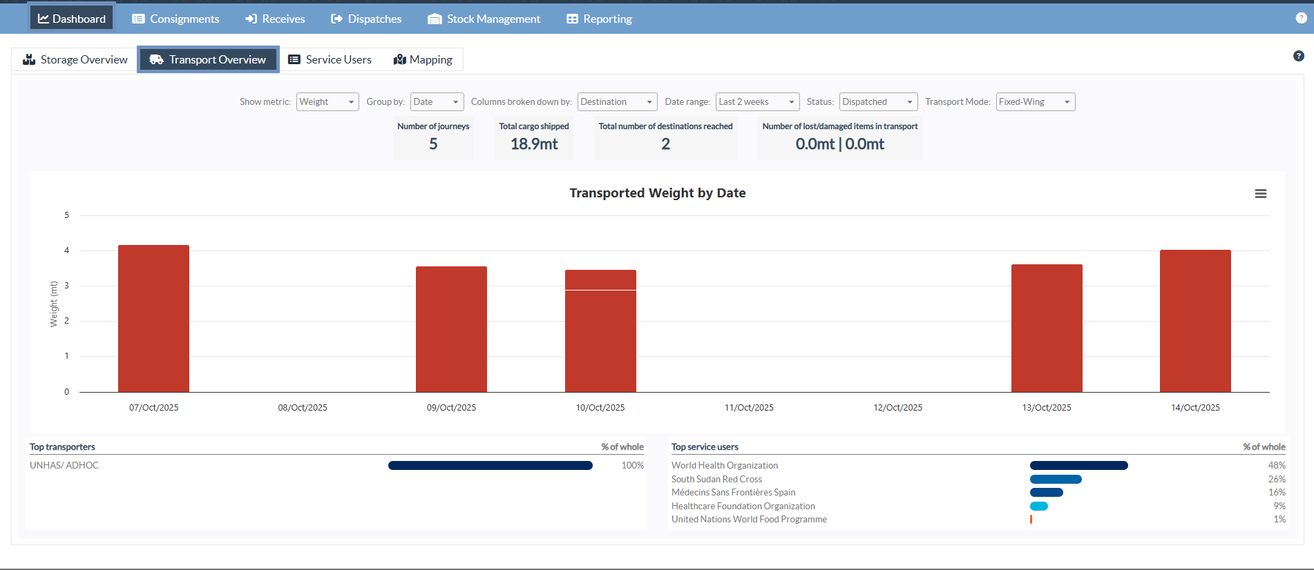
The operators can also view a summary of the top five service users (organizations that have utilized the transport services) and the top five transporters (transport providers for the selected mode, such as Fixed-Wing), displaying their respective contribution percentages to the total transported weight.

